The queues dashboard showcases queue performance metrics by queue type, day of the week, time of day, and user.
Within the dashboard, there are multiple widgets that display different queue data points. These widgets provide analytics on average wait time and the number of patients by queue, while also breaking it down by day of week and time of day.
Data Refresh Schedule
The data presented in the BI Dashboards is not updated in real time, which means there is a delay between when data is entered into the EMR and when it is viewable in the BI Dashboards. Instead, there are four scheduled BI data refreshes each work day at 3 AM, 9 AM, 1 PM, and 5 PM. There are two scheduled refresh periods on each weekend day at 3 AM and 3 PM. All times are EST.
Note: These BI data refresh periods typically last 4-6 hours and while the refresh process is uploading to the dashboards (usually the last 2 hours of the process) data may not be present or may be incomplete.
Data entered after a refresh will not be reflected in the dashboards until the following refresh is completed. When using the dashboards for analysis it is recommended to use yesterday as the most recent time period to ensure you are working with a complete data set.
Each subtab displays the date and time of the last refresh in UTC.
General Controls
Below the tabs that include the Operations, Billing, and other options, you will find several icons.
- The circular arrow refreshes the data, while the back and forward arrows undo and redo changes respectively.
- If you click on the icon of a down arrow in a box, you will access the following drop-down list.
- Use the options provided to print the current tab or download it as a PDF file. Clicking View downloads will allow you to view all downloads created from that tab previously, and to download them again.
- Additionally, each widget in the Operations section has options that can be opened by hovering over the empty space at the top right of the widget. The two arrows allow you to expand the widget to full screen, while the three dots allow you to export the data in the widget to a CSV file. You will see these options indicated in many of the following screenshots.

- Use the options provided to print the current tab to or download it as a PDF file. Clicking View downloads will allow you to view all downloads created from that tab previously, and to download them again.
- Hovering over widgets with charts, graphs, and other visual elements will display additional information.
- On all tables, you can adjust the width of a column by hovering over the divider line, then clicking and dragging it to the desired size. Doing so can, in the case of some of the larger tables, help you view more columns at once.
- You can also click on the column title to change whether the column is sorted by alphabetical or reverse alphabetical order.
- Finally, each section has Controls, which have different defaults and purposes. However, the mechanics of each section are similar. To access the controls for each tab, simply click anywhere on the controls row.
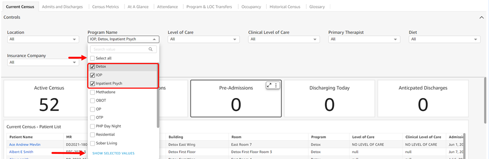
- Most drop-downs contain a series of options and many default to selecting all. You can choose specific items by unchecking the Select All option and then checking off each item individually. If you click the Show Selected Values option at the bottom of the list, you will only see the items you selected.
- The circular arrow refreshes the data, while the back and forward arrows undo and redo changes respectively.
Queues Dashboard
To begin, click on Reports > Kipu BI > Queues.
-
Controls default to All.
- Queue: The queue(s) whose metrics you wish to view.
- Checked In By: View results by name of the staff member who checked the patients in.
- Processed By: View results by the name of the staff member who processed the patient.
- Checked Out By: View results by the name of the staff member who checked the patient out.
- Location: Location options available are in accordance with the instance itself. They will match the locations found in the instance banner, and are listed alphabetically.
- Program: Program options are listed in alphabetical and/or numerical order.
- Level of Care: UR level of care options are listed in alphabetical order.
- Visit Date: View results by visit date. If you enter a manual date range, note that data from the end date will not be included (if you want reports on data from 1/1/2025-1/31/2025 you would enter 1/1/25-2/1/25 and the data from 2/1 won't be included in the report).
- Average Time and # of Patients by Queue: This widget showcases the total average time patients are being processed and waiting by queue and gives a count on the number of patients.
- Total Time: Difference between Start and End of Visit, minus Time Offset (pause time)
- Waiting Time: Total Time - Processing Time
- Processing Time: Difference between Claimed/Processed-At Time and End Time
- Number of Patients: # of Unique Patients with a Visit
- Average Time and # of Patients by Day: This widget showcases the total average time patients are being processed and waiting by day of the week and gives a count on the number of patients. When hovering over any graphical element within the widget, a tooltip will appear with information about that specific element.
-
Total Time: Difference between Start and End of Visit, minus Time Offset (pause time)
-
Waiting Time: Total Time - Processing Time
-
Processing Time: Difference between Claimed/Processed-At Time and End Time
-
Number of Patients: # of Unique Patients with a Visit
-
Average # of Patients in Queue by Time of Day: This widget showcases the average number of patients present in the queue by the hour.
- Visit Times: This pie chart breaks down Total Visit Time by providing the average time patients are being processed and waiting as well as the number of patients.
- Processing Times and Waiting Times: This dashboard provides analytics regarding processing times, wait times, and user data in different tables while giving you the count of the patients.
- Processing Time: Number of visits with processing times in each time category
- Waiting Time: Number of visits with waiting times in each time category
- User Data: This widget provides statistics on the user who processed the queue visit.
-
User: Name of each user who processed queue visits
-
Waiting: Average waiting time for visits processed by each user
-
Processing: Average processing time for visits processed by each user
-
Total: Average total time for visits processed by each user
-
# of Patients: # of patients processed by that user
-
- Visits Data: This table at the end of the dashboard provides all visit metrics broken down by patient and provides additional information for patient data. The fields include:
- Queue Name
-
Visit Date
-
Patient Name
-
Patient MR
-
Checked In At
-
Checked In By
-
Processed At
-
Processed By
-
Checked Out At
-
Checked Out By
-
Time Waiting
-
Time Processing
-
Total Time
Comments
0 comments
Article is closed for comments.